Coach USA
Coach USA
#Mobile
#Re-Design
#Accessibility

Redesign the app for a seamless travel experience
I redesigned the app to make travel simpler, faster, and more reliable. Key updates include a ticket folder, real-time bus tracking, and favorite route saving that eliminate the most common frustrations, while a streamlined booking and search flow makes planning every trip effortless.
I redesigned the app to make travel simpler, faster, and more reliable. Key updates include a ticket folder, real-time bus tracking, and favorite route saving that eliminate the most common frustrations, while a streamlined booking and search flow makes planning every trip effortless.

UX/UI Designer
2nd place out of 25 projects
Jan 2024 - May 2024
End to end
0 -> 1
Why Is Booking a Coach USA Ticket So Frustrating?
Why Is Booking a Coach USA Ticket So Frustrating?
Coach USA is a leading transportation provider, offering a wide range of services across the United States and Canada. From intercity and local buses to city sightseeing tours, school transportation, and private charters, the Coach USA app helps passengers navigate their journeys with convenience and reliability

These pain points erode rider trust, increase pressure on customer service teams, and risk losing passengers to competitors like Greyhound and Megabus.
Why a Re-Design?
Why a Re-Design?
Through user interviews and app review analysis, I uncovered recurring pain points among Coach USA riders. I addressed them by improving existing flows and introducing new, high-impact features:
A smarter way to buy tickets
A smarter way to buy tickets
The route search and ticket purchase systems were not integrated, creating redundant steps in the booking process
Accurate, real-time bus updates
Accurate, real-time bus updates
Without real-time tracking, passengers often arrived late or waited unnecessarily, unsure if the bus had already left or was running behind
Easy navigation to bus stops
Easy navigation to bus stops
The app lacked direct map integration, making it harder for passengers to locate stops, especially in unfamiliar areas
Pain Points Driving New Features
Pain Points Driving New Features
A single place to store tickets
Passengers had to search emails to find purchased tickets. For multi-ride passes, the app didn’t show remaining rides, forcing them to manually track usage and sometimes leading to missed trips
Quick access to favorite routes
Frequent passengers had to search for the same route every time, adding unnecessary steps to trip planning
User Pain Points in Existing Flows
User Pain Points in Existing Flows
Defining the Challenge

How might we personalize the bus transportation experience and make passenger planning enjoyable?


Do the users like the new Coach USA features?
Do the users like the new Coach USA features?
I recruited 10+ active Coach USA riders for user interviews and assigned 5 defined tasks using a paper prototype.
Collected feedback with participant consent.
I recruited 10+ active Coach USA riders for user interviews and assigned 4 defined tasks using a paper prototype. Collected feedback with participant consent.
Tasks
1
Search a route and book a ticket
2
Check real-time bus information
3
Find a bus stop
4
Save a route as favorite
5
Update account settings
Interests & Concerns
1
Desire for quicker ticket purchasing without repeated searches
2
Need for accurate, live bus updates
3
Frequent use of the same routes
4
Account settings were already satisfactory and did not require changes
Interview Insights
Interview Insights
100% users
of users preferred having real-time bus tracking over static schedules
8/10 riders
riders considered ticket storage essential for smoother boarding
100% features
of users found it intuitive and easy to use
70% participants
of participants wanted a “Save Favorite Route” option
TWO Personas


Information Architecture
Information Architecture

User Flow
User Flow

Ideation & Sketching
Ideation & Sketching
I drafted sketches with possible solutions to the issues identified after organizing research findings using Affinity Diagram. Then I generated 25+ ideas and prioritized real-time bus tracking, favorite routes for quick access, and integrated ticket storage.

Affinity Diagram
|
Sketch

Affinity Diagram
|
Sketch
High-Fidelity Prototyping - First Draft
Here is the first high-fidelity prototype based on prioritized features and refined flows from the sketching stage.

☟But the design journey didn’t stop here…☟
☟But the design journey didn’t stop here…☟
Heuristic Evaluation, Accessibility Audit, UX Improvements
I conducted the design against Nielsen's 10 Heuristics and WCAG guidelines to ensure color contrast, text legibility, and interactive element accessibilitydesign of interactive elements for diverse passenger needs. I also refined interactions and layout details to improve overall usability.
Iteration 1 - Heuristic Evaluation
Iteration 1 - Heuristic Evaluation
Nielsen's 10 Heuristics for Usability Evaluation
I keep a heuristic evaluation on the website following Nielsen's 10 Heuristics for Usability Evaluation
2
Match Between the System and the Real World
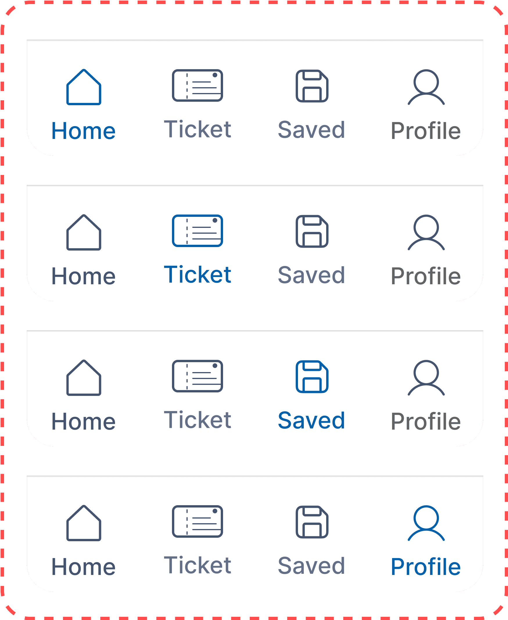

Before
Selected footer bar icons only used subtle color changes, making it hard for passengers to identify the active menu


After
I changed selected icons from outlined to filled for clearer visual feedback and easier menu recognition.
Iteration 2 - Accessibility Audit
Iteration 2 - Accessibility Audit
WCAG 2.0 Conformance Levels
WCAG 2.0 guidelines are categorized into 3 levels of conformance in order to meet the needs of different groups and different situations:
A (lowest)
AA (mid range)
AAA (higghest)

Before
1
Contrast Ratio - 3.24:1
Normal Text: WCAG AA: Fail / WCAG AAA: Fail
2
Contrast Ratio - 5.07:1
Normal Text: WCAG AA: Pass / WCAG AAA: Fail

After
1
Contrast Ratio - 8.18:1
Normal Text: WCAG AA: Pass / WCAG AAA: Pass
2
Contrast Ratio - 7.81:1
Normal Text: WCAG AA: Pass / WCAG AAA: Pass
Iteration 3 - UX Improvements
Iteration 3 - UX Improvements
Enhance Date and Time Selection

Before
"I have to scroll back up every time I want to change the date. It’s annoying when I just want to compare schedules."
— Passenger during usability testing
After
I made the date and time bar sticky so travelers can easily change dates and compare schedules on any screen
These are just the tip of the iceberg...
☟ discover how all the iterations come together in the Final Design ☟
☟ discover how all the iterations come together in the Final Design ☟
Final Design
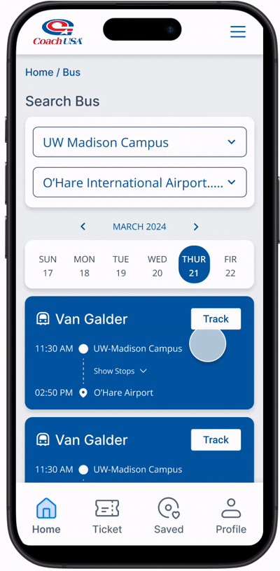
Real-Time Tracking
Passengers can search for a route, then choose to view live updates by time or map. They can also purchase tickets or save routes directly from the tracking screen.


Saved Favorite Route
From the footer menu, passengers can view all saved routes and stops in one place. They can easily add new ones or enable notifications for frequent trips
Ticket Folder
A new ticket folder keeps all purchased tickets in-app, eliminating the need to dig through email before boarding


Find Bus Stop
After searching a route, passengers can view detailed stop information and instantly purchase a ticket or save the stop as a favorite
Design System
What I learned

Iteration Leads to Growth
Iteration Leads to Growth
Refining the Coach USA app through multiple design cycles showed me that even small adjustments can significantly improve usability. User testing sessions uncovered friction points such as unclear button labels and non-sticky date selectors, which guided each round of iteration. I learned that continuous testing and feedback loops are essential for aligning the product with passenger expectations and habits
The Value of Qualitative Insights
The Value of Qualitative Insights
By combining rider interviews with app review analysis, I was able to prioritize changes that addressed the most pressing passenger needs. Qualitative insights revealed frustrations that metrics alone could not capture, such as the anxiety of waiting without real-time updates. This experience reinforced the importance of balancing qualitative and quantitative data to inform impactful UX decisions