Coach USA
Intercity buses are a vital mode of transportation in the U.S., and Coach USA is a key player in this space. The goal of this project is to explore new flows to enhance passenger support during their journeys.
TIMELINE
Jan 2024 - May 2024
ROLE
UX/UI Designer
2nd place out of 25 projects
FOCUS
UX Design
Task Flow Design
Prototype
Design System
User Interview
TOOLS
Figma
Figjam
Miro

PROBLEM STATEMENT
"How might we personalize the bus transportation system experience and make passenger planning enjoyable?"
PROLECT OVERVIEW
What is the COACH USA app?
Coach USA is a leading transportation provider, offering a wide range of services across the United States and Canada. From intercity and local buses to city sightseeing tours, school transportation, and private charters, the Coach USA app helps passengers navigate their journeys with convenience and reliability
Pain Points
User
Mainly commuters in the United States and Canada
Goal
Provide easy access to book the ticket, Streamline the searching and ticketing process
BACKGROUND
Everything starts with a journey
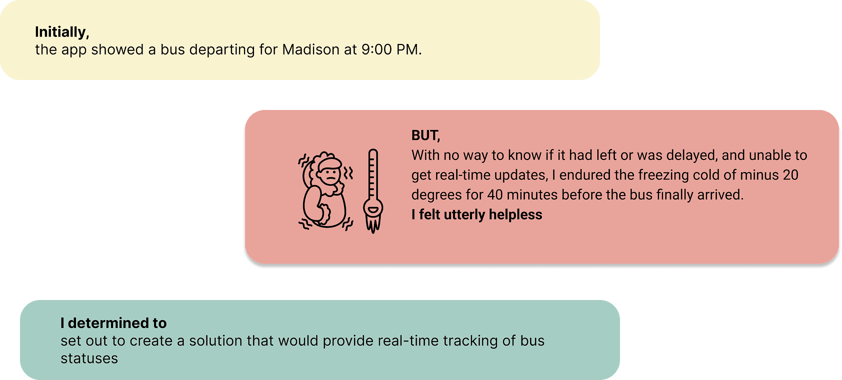
As I landed at O'Hare International Airport one evening, excited to catch a Coach USA bus back to school in Madison...
PROCESS
How I go through my way to the goal
Applying the human-centered design principle, I went through multiple iterations to redesign the application. This process isn't straightforward; instead, each step is revisited and adjusted iteratively to refine the design continuously
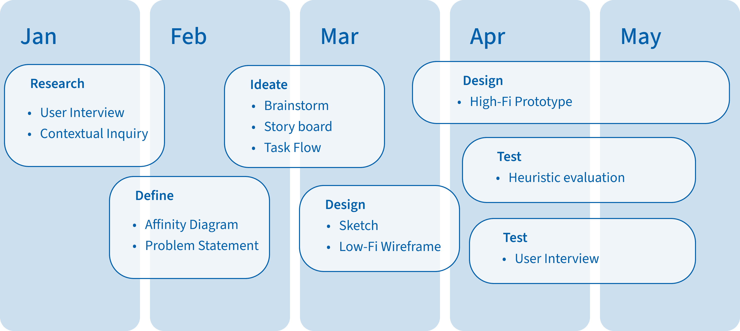
USER INTERVIEW
Am I thinking the same way as other users?
First, I conducted User Interview to gather early insights into users' thoughts, beliefs, mental models, and experiences with the Coach USA app. This helped me understand their expectations and common frustrations
Ticketing and Payment Convenience
Users find the current ticket purchasing process confusing and inconvenient
Real-time Information
All Users are concerned about knowing the exact location and arrival time of buses
Social and Community Features
5 out of 6 users are interested in features that allow them to share experiences and recommendations with others
CONTEXTUAL INQUIRY
Then, to bridge the gap between what users say and how they interact with the app, I conducted Contextual Inquiry with 4+ users, observing them in real-world scenarios to uncover hidden pain points and identify opportunities for improvement. This allowed me to see firsthand where the app’s usability fell short and what users truly needed.
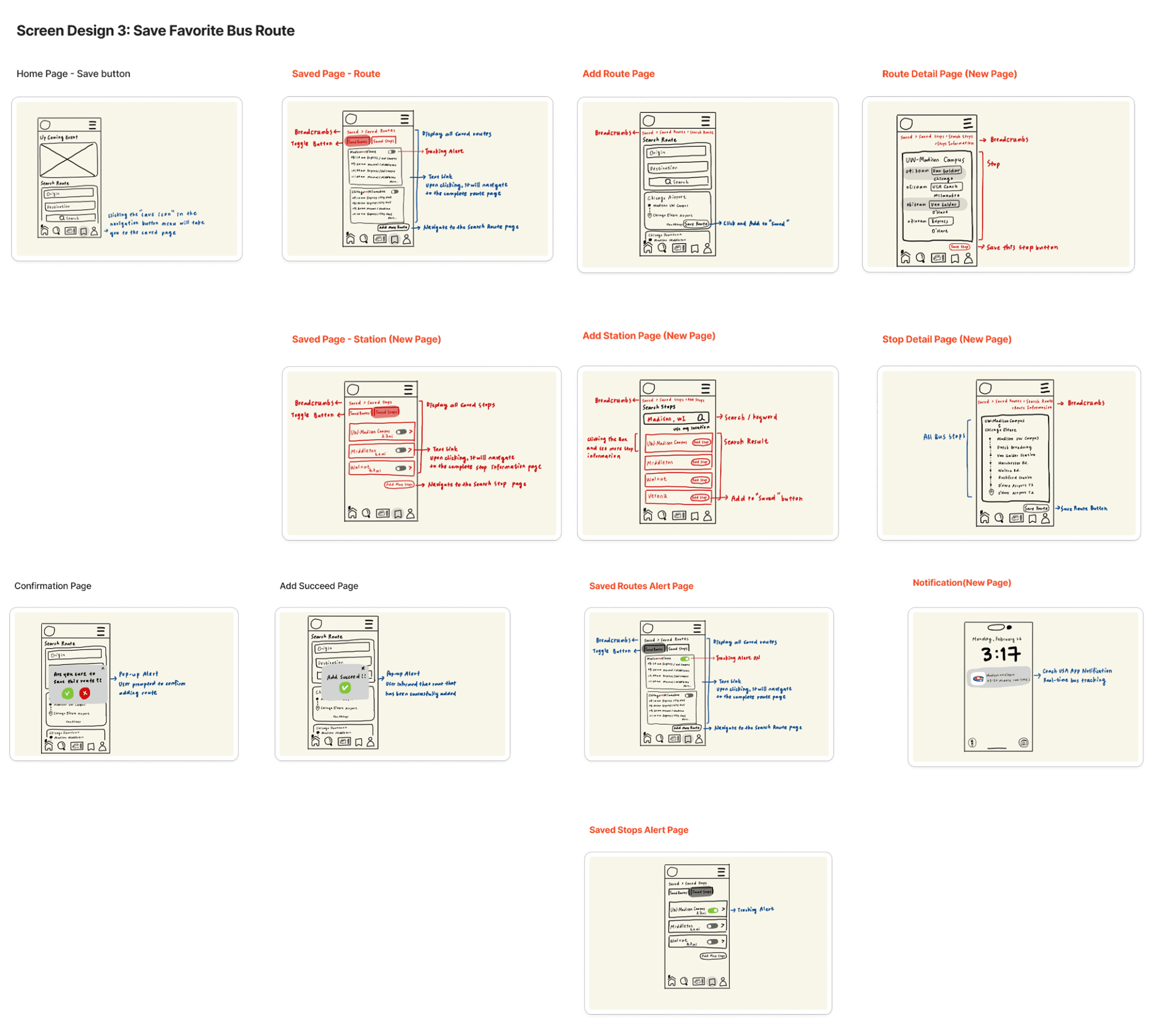
Save Favorite Route
4 users mentioned that they frequently search for the same route and hope to avoid repeating the search process each time
Find the Bus Stop
Users need information on available bus stops before they start searching
Ticket Folder
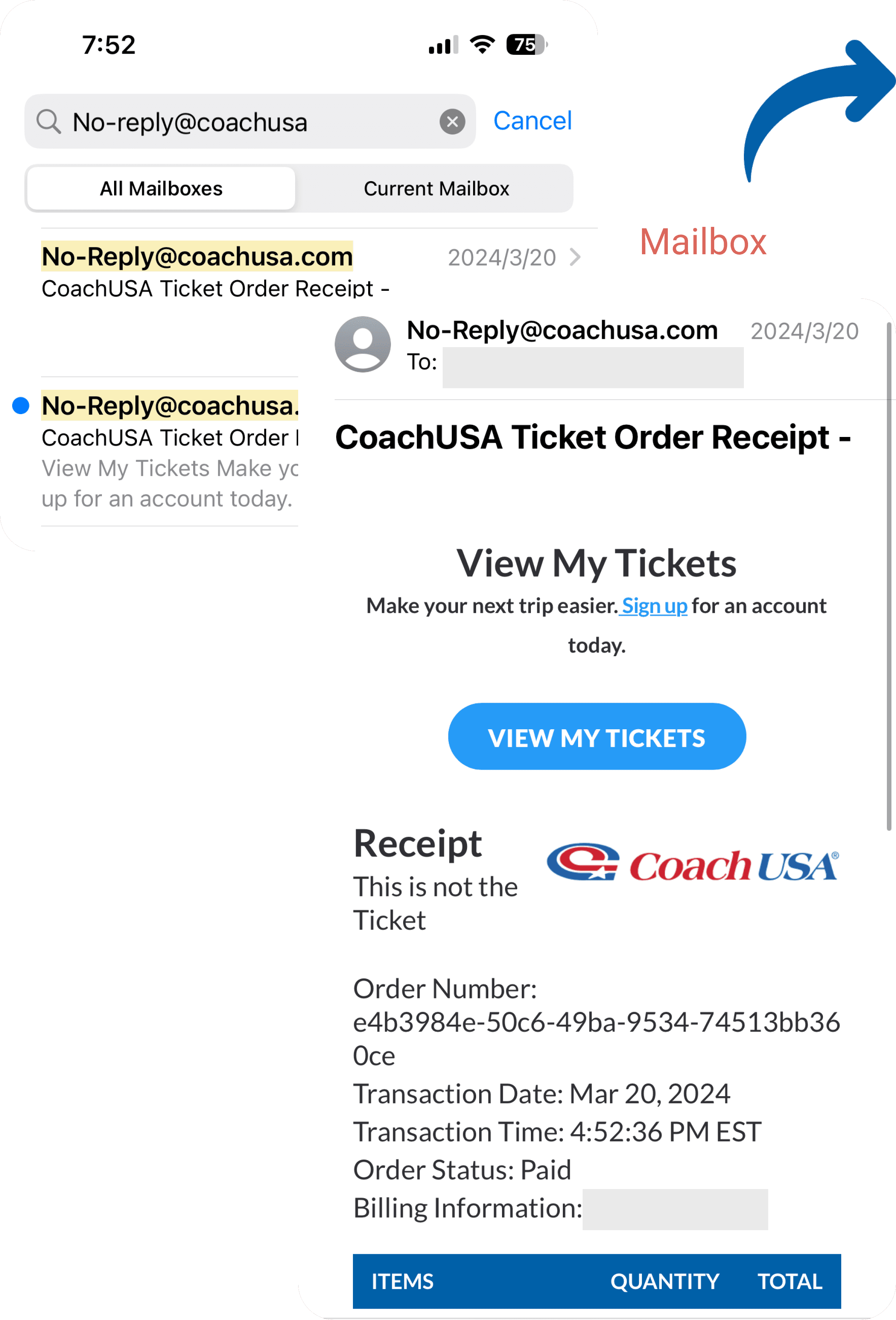
All 4 users expressed the desire to store purchased tickets within the app, reducing the need to search through emails for tickets before boarding the bus
IDEATE
Exploring Best Practices for Solutions
My approach to finding the right solution involved applying Design Thinking principles:
STAGE 01
Divergent Thinking
I BRAINSTORM diverse ideas without limiting myself to explore 20+ various possibilities
STAGE 02
Convergent Thinking
I selected viable options and made design decisions through STORYBOARD and TASK FLOW
STAGE 03
Prototyping and Testing
I focused on creating both LOW-FIDELITY and HIGH-FIDELITY then TESTING them to refine and improve the solutions
STAGE 04
Finalizing Design
Lastly, I merged the most promising designs and polished them to deliver the final solution
STAGE 01
Brainstorming & Solution Exploration
Building on insights from usability testing, I generated 25+ potential solutions to address key user concerns. By analyzing qualitative data, I identified recurring pain points and refined the most impactful ideas:
KEY POINTS:
1. Integrated Ticketing System
2. Real-time Bus Tracking
3. Save Favorite Route

👩🏻💻Shana's take: Affinity Diagrams are one of my favorite ways to distill complex user feedback into clear UX insights. By identifying patterns and pain points, I can bridge user needs with actionable design solutions, ensuring every decision is both user-centered and strategic.
STAGE 02
Story Board
First, to help users visualize real-world scenarios, I designed a storyboard that illustrates how personalized features and real-time tracking can transform their journey.
By mapping out user interactions, the storyboard highlights opportunities to enhance convenience, reduce uncertainty, and improve overall satisfaction with the Coach USA app.
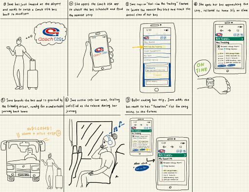
The storyboard highlights opportunities to enhance convenience, reduce uncertainty, and improve overall satisfaction with the Coach USA app
Task Flow
Then, to create a seamless user experience, I leveraged task flows to map key interactions and streamline navigation. I started by conducting initial content audits and gathering insights to create 5+ task flows
In this case, I explored edge cases—what if users didn’t save a route beforehand? To address this, I designed a Saved Favorite Route feature that allows users to quickly bookmark frequent routes while keeping the experience intuitive and distraction-free

Users can search for routes as they normally would, then select their preferred route and tap the Save button for quick access in the future
STAGE 03 -1
Low-Fidelity • Sketching
To realize the fundamental task flow, I sketched out designs, aiming to achieve the best layout and content for the target users on the specific platform while maintaining consistency.
For the Saved Favorite Route feature, I started with low-fidelity sketches to explore different layouts and interactions, I integrated the task flows and made revisions twice, highlighting incomplete areas in red
STAGE 03-2
High-Fidelity • Prototype
In the mockups, I applied Design System and Components, ensured consistency and coherence throughout the interface. The Auto Layout feature in Figma facilitated a streamlined design process, reducing time and effort while maintaining a polished and professional appearance.


👩🏻💻Shana's take: I loosely referenced a 6-column grid, which is a versatile (& my personal favorite) mobile grid as you can easily align one item, two items, or three items in each row. I also made sure all commonly tapped elements were within a reasonable mobile thumb zone range
What makes it SOO GOOD?
1) Navbar Iterations
I replaced left/right arrows with Breadcrumbs for a cleaner interface and more intuitive navigation, allowing users to jump directly to their desired page.
Additionally, I redesigned the Navbar into a combined Navbar-Footbar, integrating shortcuts like Home and Favorites to streamline access and reduce user effort.

2) Content Iterations
I divided the original Search Area into two sections:
1. Upcoming Events/News and
2. Search Area
By separating these two sections conveying different information, the interface appears more visually clear, and I added Events to inform users about upcoming journeys. The Search Area also maintains the redesigned minimalist style.
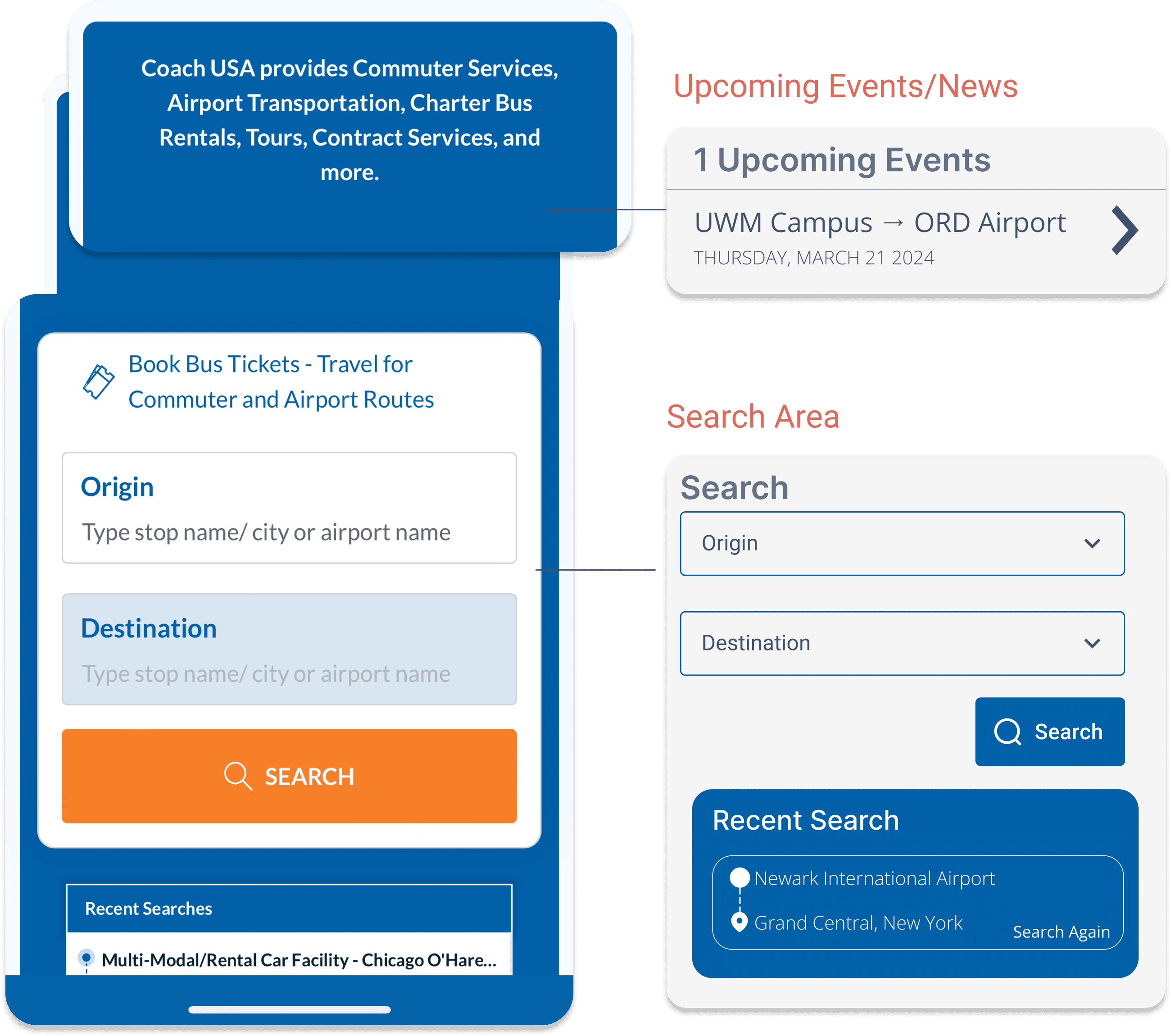
3) Content Iterations
I divided the original Search Area into two sections:
1. Upcoming Events/News and
2. Search Area
By separating these two sections conveying different information, the interface appears more visually clear, and I added Events to inform users about upcoming journeys. The Search Area also maintains the redesigned minimalist style.

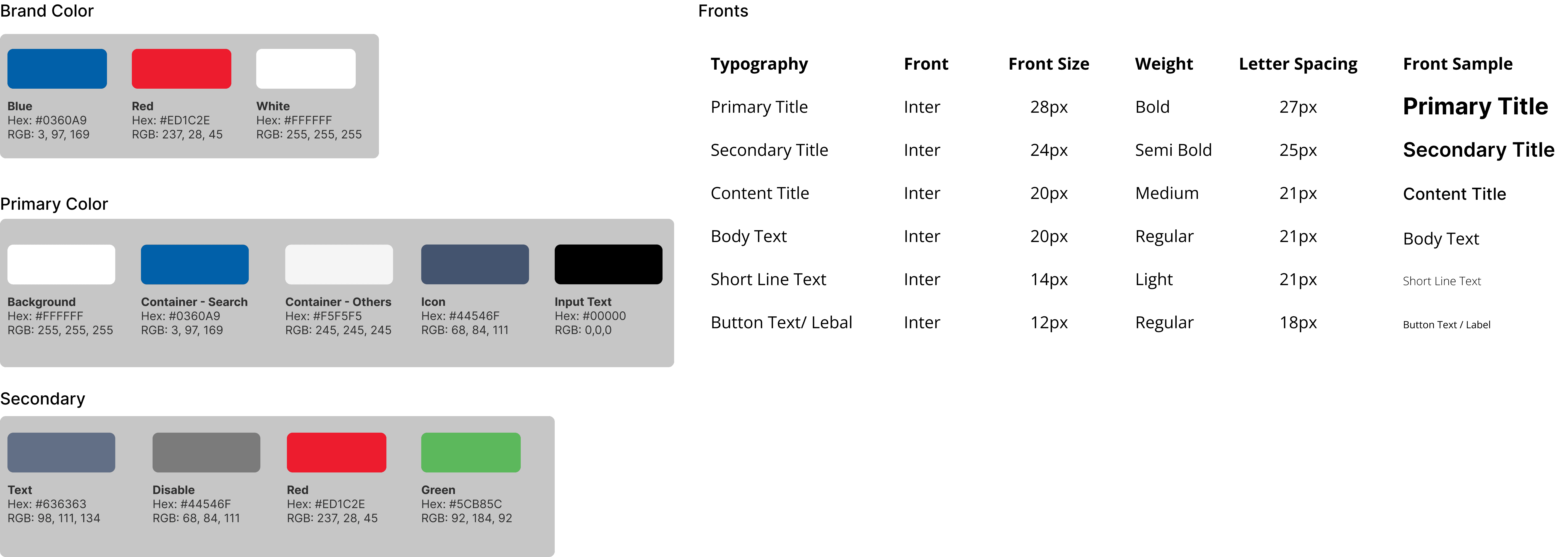
Design System
I like the original design system's color scheme, which incorporates blue, red, and white. I speculate that it utilizes these colors due to their association with the USA flag. I chose Inter, as it’s simple, easygoing, and readable. Also, I made sure all font sizes were reasonably accessible.

TESTING & HEURISTIC EVALUATION
Usability testing at the source
During usability testing with 5+ tester, I received valuable feedback that significantly assisted in iterating and improving my mockups:
🥰 LIKES
1. Interest in Real-Time Tracking
2. Helps users reduce repeated searches
3. Clear and concise page layout
🎋 WANTS
1. Clearer naming for buttons
2. Sticky Date for Clarity
3. Interface Visibility
Testing Updates
1) Clear Button Labels
Rename buttons to reduce confusion before users click them
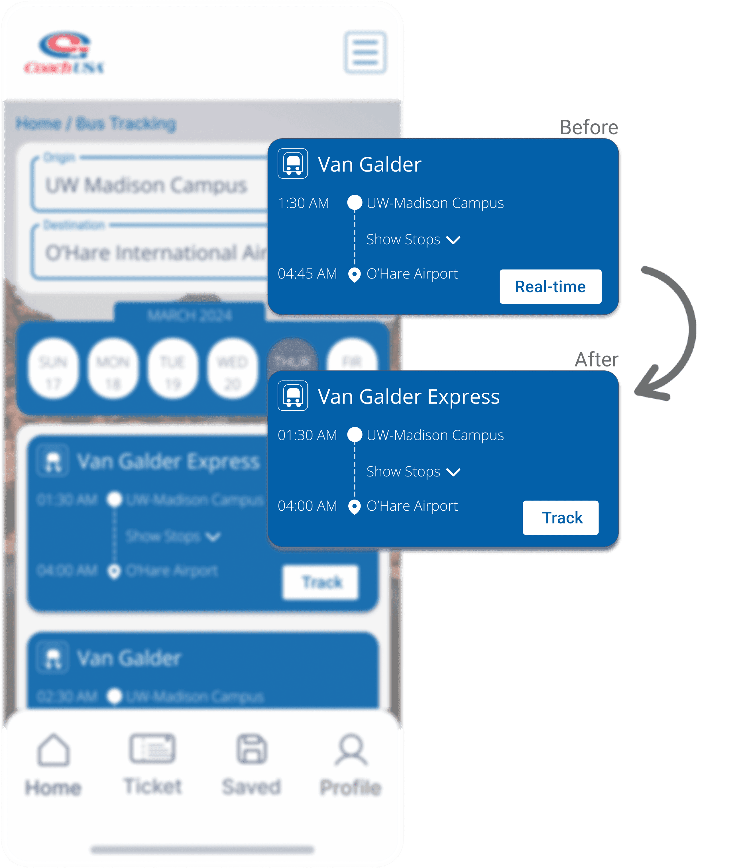
2) Enhance Date and Time Selection
Stick the date time selection bar, allowing travelers to easily change the date to compare available schedules


Improve Tab Visibility
Differentiate between selected and unselected tabs by making the unselected tab blue and the selected tab white

COACH USA REDESIGN
After processing with Paper Prototyping to gather user feedback on position and presentation, I conducted a Heuristic Evaluation to ensure alignment with design usability, and Refined each flow accordingly.
Finally, here is my final prototype!!

BRIEF LOOK-BACK
What I learned
• Even for experts, achieving perfect design at once is challenging. We must continuously iterate, narrowing down the scope to clearly define the problem and ensure it aligns with the users' core needs
Imitation is the first step in learning
• Whether it's wireframe mockups or screen designs, we study highly-rated apps to understand what makes them successful, how their designs attract users, and what grid and layout designs make users feel comfortable. We learn and digest these elements to build our arsenal for future projects.
Keep Iterate! Keep Iterate! Keep Iterate!
• I had originally moved to high fidelity too early and learned to slow down… design is a circular process and there is always room for more iterations!