
Fetch Rewards
Fetch Rewards had a strong user base but lacked key usability features like filters and personalized recommendations. This evaluation identified pain points and provided data-driven insights to enhance navigation, personalization, and engagement, shaping future improvements for a more seamless user experience.
TIMELINE
Sep 2024 - Dec 2024
ROLE
Solo User Researcher
FOCUS
Competitive Analysis
Usability Test
Scanner Survey
Moderator Guide
TOOLS
Figma
Miro
Zoom


PROLECT OVERVIEW
🎯 Purpose
The research aimed to uncover usability issues that hinder user engagement, retention, and satisfaction, focusing on the My Account and Rewards Redemption features.
🔎 Objectives
• Identify and address pain points in navigation, points accumulation, and reward redemption
• Evaluate the app’s recommendation system to enhance its relevance and usability
• Provide actionable design recommendations to improve user satisfaction and app engagement
BACKGROUND
Why is FETCH REWARDS?
Fetch Rewards promises to reward users for everyday purchases, yet users frequently express concerns about the trustworthiness of its point redemption process. Online reviews highlight fears of losing points or facing technical issues during redemption
Research Goals
1. Increase user confidence in redeeming points without fear of loss or technical failures
2. Enhance the redemption experience to drive consistent usage and improve user retention
By addressing these trust-related pain points, this research aims to create a more reliable and satisfying user experience

User Feedback on Reddit
COMPETITIVE ANALYSIS
Identifying Key Gaps in Fetch Rewards
To evaluate Fetch Rewards against industry leaders like Rakuten and Starbucks Rewards, I conducted a comparative analysis, uncovering critical areas for improvement. While Fetch offers a simple receipt-scanning experience, it lacks key features that enhance user engagement and trust
Key Findings
Lack of Reward Filters
Insight: Users struggle to find relevant rewards due to missing filters
Next Step: Include a usability test task to measure frustration and search time
No Strategic Guidance for Earning Points
Insight: Unlike competitors, Fetch provides no incentives or strategies to maximize points
Next Step: Observe decision-making behaviors in planning tasks.
Limited Transparency in Points History
Insight: Fetch lacks detailed tracking, making it harder to resolve discrepancies
Next Step: Test if users can efficiently review and dispute point inconsistencies.

💡 Shana's Insight: Competitive analysis isn’t just about comparison—it helps identify gaps that usability testing can validate, ensuring targeted improvements
METHODOLOGY
Methods I Used to Complete the Research...

USABILITY TEST
Uncovering & Solving Key UX Gaps
To address trust, clarity, and usability issues in Fetch Rewards, I conducted a Pilot Usability Test, refining it into a Final Usability Test based on key insights
Research Question
TASK 1: Exploring Available Rewards and Planning Points Strategy
TASK 2: Planning Points Strategy
Task 3: Reviewing Points and Reward History
Research Approach
Participant Recruitment: Screener survey targeting users (ages 18-40) with experience in rewards app
Testing Format: Conducted both in-person and remote moderated sessions via Zoom + Figma prototype
Structured Methodology:
Developed three task-based scenarios covering navigation, rewards redemption, and points tracking.
Facilitated and documented user interactions, frustrations, and decision-making.
Created key research tools: Moderator Guide, consent form, Likert-scale feedback, and qualitative analysis codebook.

💡 Shana's Insight: Usability testing isn’t about the number of participants—it's about asking the right questions and uncovering the “why” behind behaviors
💣 However, things did not turn out so well....
The research began with a Pilot Usability Test designed to evaluate key interactions, such as navigating rewards, redeeming points, and reviewing point histories. During this pilot phase, I identified critical usability challenges....
🧪 Pilot Usability Test
TASK 1: Exploring Available Rewards and Planning Points Strategy
TASK2: Checking Points Balance and Redeeming Points
TASK3: Reviewing Points History and Reporting a Problem
🎯 Final Usability Test
TASK 1: Exploring Available Rewards and Planning Points Strategy
TASK 2: Planning Points Strategy
Task 3: Reviewing Points and Reward History
Key Iterations from Pilot to Final Test
Filtering Rewards: Users struggled to find relevant rewards → Added a task to assess frustration
Task Order Refinement: Planning before exploring rewards was unintuitive → Adjusted sequence
💡 Shana's Insight: Usability testing is an iterative process—each round refines the design to better align with user needs
USABILITY ANALYSIS
From Raw Data to Actionable Insights
Transforming raw usability data into meaningful insights is crucial for making informed design decisions. By categorizing feedback into themes, I uncovered patterns that helped prioritize user needs and drive impactful improvements. This structured approach ensured that my usability findings directly translated into actionable design improvements. 🚀
My Process
Task-Based Organization
Grouped usability issues by task, such as Exploring Rewards, Planning Points Strategy, and Reviewing Points History. Each note included participant IDs and task references for traceability before importing data into MiroImpact-Based Categorization
Sorted feedback into positive, negative, and neutral categories to highlight strengths and pinpoint problem areas requiring immediate attentionInsight Synthesis
Identified recurring themes like missing filters, unclear button functions, and lack of personalized recommendations. These insights informed my initial design suggestions, which evolved into concrete recommendations for Fetch Rewards.
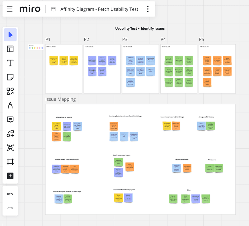
💡 Shana's Insight: Creating a codebook in Excel before using tools like Miro helps streamline the analysis process
USABILITY METRICS & FINDINGS
From Usability Data to UX Insights
By applying UX metrics, I identified patterns in user struggles, validating my initial research focus and guiding design improvements.
💡 Shana's Insight: Quantifying usability issues helps bridge the gap between observation and action
SEQ(Single Ease Question)
Question: How easy was it to find a reward that interested you?

🚨 Users struggled due to:
Lack of filtering options, leading to excessive scrolling
Poor reward visibility, making it difficult to find relevant options
NPS (Net Promoter Score)
How likely are you to recommend Fetch Rewards?
⭐️ User sentiment was mixed due to:
Slow point accumulation, reducing engagement
Limited reward variety, failing to meet user expectations
Lack of referral incentives, impacting long-term retention
Time on Task
Where did users experience delays?
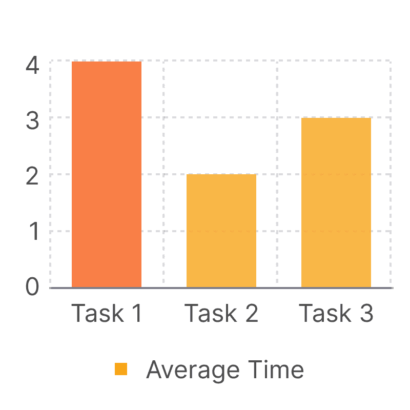
⏳ Major friction points:
No points-range filter, causing users to scroll extensively
Unclear game page instructions, leading to hesitation
Confusing button labels on the Point Activity page
Error Rate
Task: Rewards Redemption
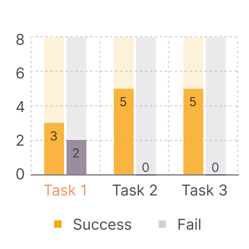
⚠️ Primary usability issue:
Low visibility of the redeem button, causing confusion and delays
Aligning Findings with Research Goals
The usability test results validated the initial research focus, reinforcing key areas for improvement:
✔️ Trust in the point system – Users found the redemption process unclear, making them question the value of their points.
✔️ Efficient rewards discovery – The lack of filters and poor visibility hindered navigation and decision-making.
✔️ User engagement & retention – Limited reward appeal and slow accumulation rates discouraged continued use
These findings directly informed data-driven design recommendations, focusing on enhancing clarity, improving navigation, and increasing user motivation to engage with Fetch Rewards. 🚀
RECOMMENDATION
Exploring Best Practices for Solutions
My research uncovered four design implications and two strategic business recommendations to enhance both user experience and operational effectiveness
1) Missing Filter for Rewards
Participants struggled to find redeemable rewards due to lacking a points range or category filter. The absencee of these filters required excessive scrolling reduced efficiency
Proposed Solution:
Introduce filters to sort rewards by points range (e.g., "Low to High" and "High to Low") and categories (e.g., food, electronics, gift cards)
Add advanced filtering options in the search bar, such as filtering by brand, store, or redemption method
“It’s frustrating to keep scrolling just to find something I can actually afford with my points.” - Participant 3
💡 Shana's Insight: The lack of a "Low to High" filter may reflect a dark pattern aimed at nudging users with fewer points to purchase more by emphasizing higher-value rewards, prioritizing business goals over transparency.
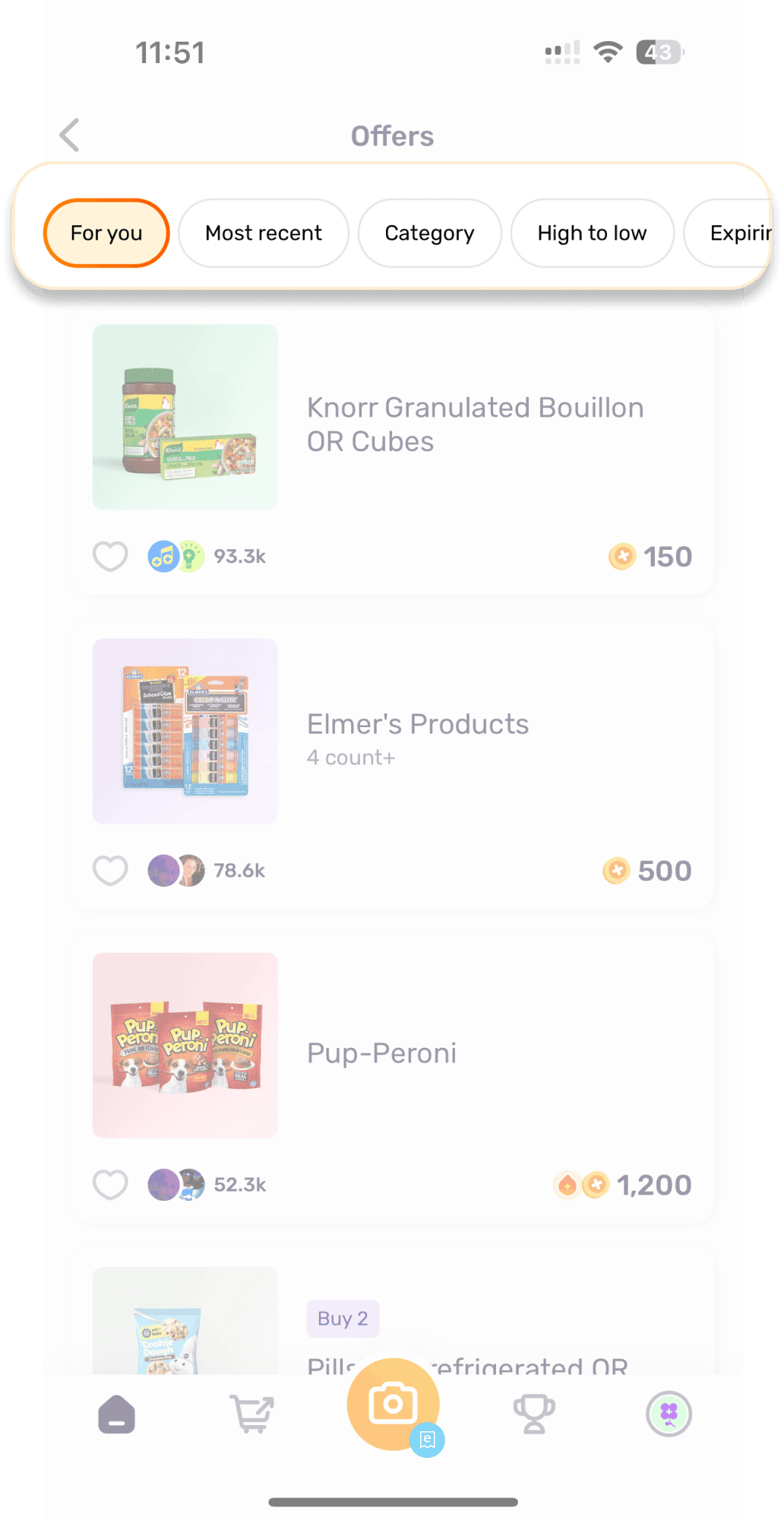
Lacking a points range or category filter
2) Hard-to-Recognize Products on Home Page
Products on the home page lack labels, making itdifficult for users to identify unfamiliar items. Smallproduct images further complicate recognition,forcing users to click for details
Proposed Solution:
Add product names or brief descriptions below each product image on the home page
Increase image size for better visibility and recognition of unfamiliar products.
“I end up clicking on multiple items just to figure out what they are.” - Participant 1
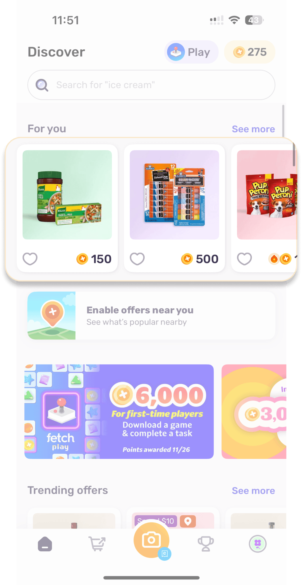
Small images and missing product names make it hard for users to recognize product
3) Poorly Designed Recommendation System
Participants found the app’s recommended productsunappealing and irrelevant to their interests orneeds. The recommendation system's lack ofpersonalization reduced its usefulness andengagement value
Proposed Solution:
Personalize the recommendation system by analyzing user purchase history, scanned receipts, and past redemptions
Create a "Recommended for You" section featuring relevant rewards and offers tailored to individual preferences.Implement a feedback mechanism to improve recommendation accuracy (e.g., "Like" or "Not Interested" buttons)
“Most of the recommended products don’t appeal to me at all.” - Participant 5
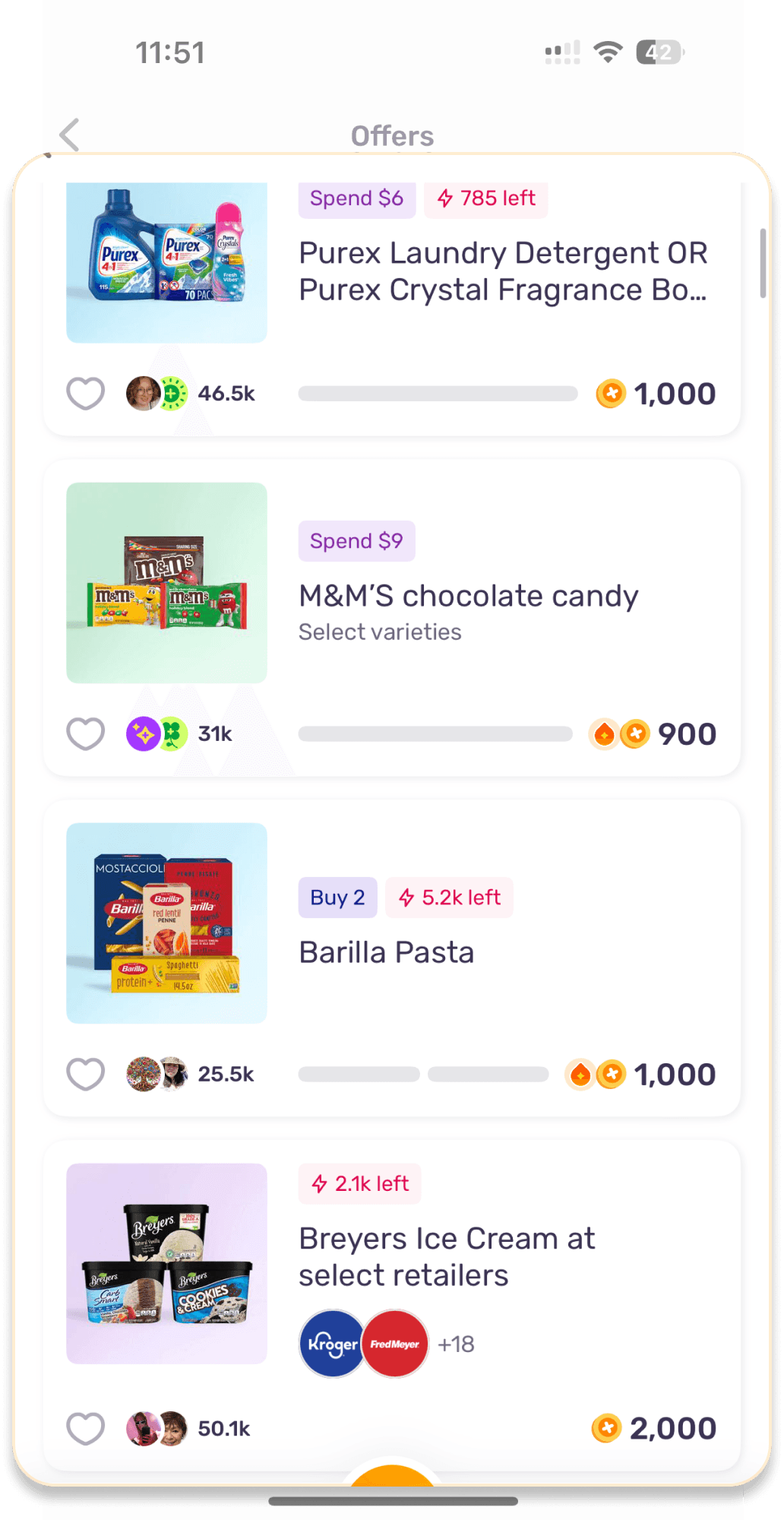
The recommendation system lacks alignment with users' purchasing preferences
4) Confusing Button Functions on "Point Activity" Page
The Point Activity page features twoidentical-looking buttons that provide nodistinguishable functionality, leaving users needing clarification
Proposed Solution:
Redesign the buttons with clear and descriptive labels indicating their functionality
Include tooltips or a short description to provide additional context when users hover over the buttons.Remove redundant or non-functional buttons.
“The buttons on this page are confusing; I don’t understand their purpose.”- Participant 2

Pressing the two buttons provides no visible feedback, leaving users uncertain if their actions were successful
To enhance user retention, I identified two "Business Improvements"
1) Slow and Unclear Points Accumulation
“I’ve been using the app for months, and I still can’t redeem anything meaningful.”- Participant 4
Proposed Solution:
• Combine a "Refer Friends" feature with attractive bonuses to address interviewee feedback about insufficient incentives. Offer 1,000 points for each successful referral or for new users upon joining
• Provide a clear and detailed guide on earning points efficiently, including strategies like daily challenges, shopping bonuses, or streak rewardsIntroduce additional points-earning opportunities, such as partnerships with retailers or limited-time promotional offers
• Use progress bars or visual indicators to show points accumulation milestones, helping users track their progress towards rewards
2) Introduce a Social Features Page(Friends)
Proposed Solution:
• Create a "Friends" page where users can follow friends, view their redeemed rewards, and share recommendations. Add incentives for social interaction, such as bonus points for referrals.
• By allowing users to view the rewards their friends have redeemed or the deals they have used, the app can inspire ideas and increase redemption rates, fostering greater engagement.
• Encourages social engagement, increasing app interaction and user retentio
BRIEF LOOK-BACK
My Key Takeaway
1) User feedback is essential, but prioritizing changes that align with Fetch Rewards’ core experience is crucial for meaningful improvements
2) Enhancing usability requires iterative refinement, balancing trade-offs, and maximizing user impact
3) Understanding users’ true motivations goes beyond surface-level feedback—it’s about uncovering the deeper needs behind their behaviors.